

Quick summary
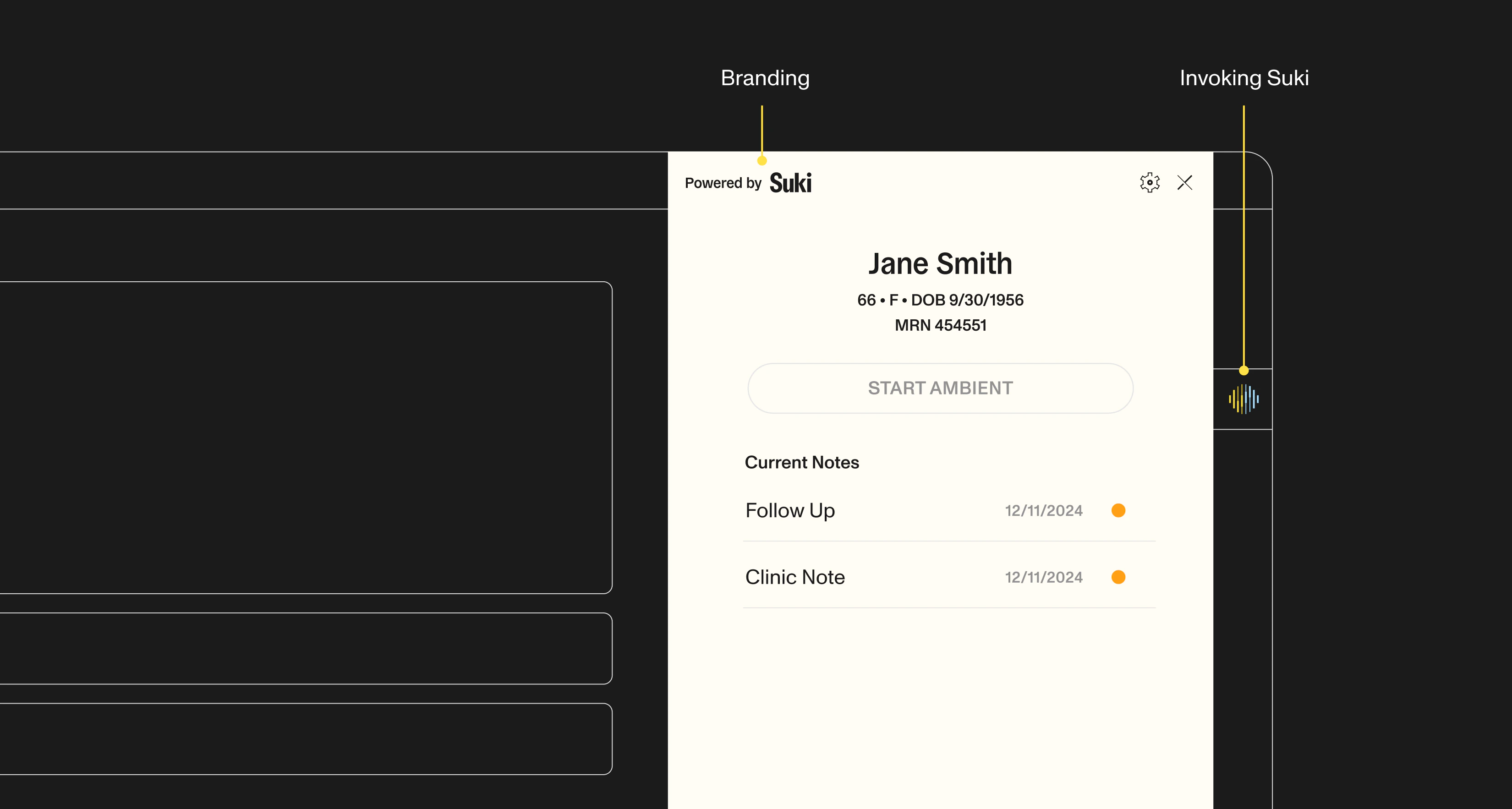
The Suki SDK comes with an out-of-the-box UI component that automatically manages user states, recording flows, and error handling. The default recommended dimensions for optimal display are 360 pixels in width and 912 pixels in height.
Widths exceeding 360 pixels are acceptable, and the height can be adjusted to match the enclosing window’s dimensions. Optional theme colors and UI options let you align the headed SDK with your application shell.
Widths exceeding 360 pixels are acceptable, and the height can be adjusted to match the enclosing window’s dimensions. Optional theme colors and UI options let you align the headed SDK with your application shell.
Common integration patterns and use cases
Design the headed Web SDK embed around layout, optional theme colors, and UI chrome toggles so the ambient experience fits your application shell. The headed SDK owns the ambient UI; your application owns mount configuration, submission handling, and EHR writeback. The following patterns show common ways to brand and size the headed Web SDK for your application:Use the Recommended Embed Size
Size the SDK container to about 360px width and 912px height for the default headed UI experience.
Widen Beyond the Default Width
Allow widths greater than 360px when your host layout needs a wider panel. Keep height aligned with the enclosing window.
Match Host Window Height
Adjust the SDK height to the enclosing window so the full recording and note workflow remains visible without clipping.
Pass Optional Theme Colors on Init
Set
theme on init with ThemeOptions fields such as primary, background, secondaryBackground, foreground, and warning. Omit theme to keep Suki brand defaults.Toggle Headed UI Controls
Pass
uiOptions to SukiAssistant to control chrome such as showCloseButton, showCreateEmptyNoteButton, showStartAmbientButton, and sectionEditing.Spacing and layout guidelines
The Suki SDK comes with an out-of-the-box UI component that will automatically manage user states, recording flows and error handling, allowing you to provide your users with a seamless experience. Below are a set of recommended guidelines on the width and height of the SDK UI when embedding it in your application.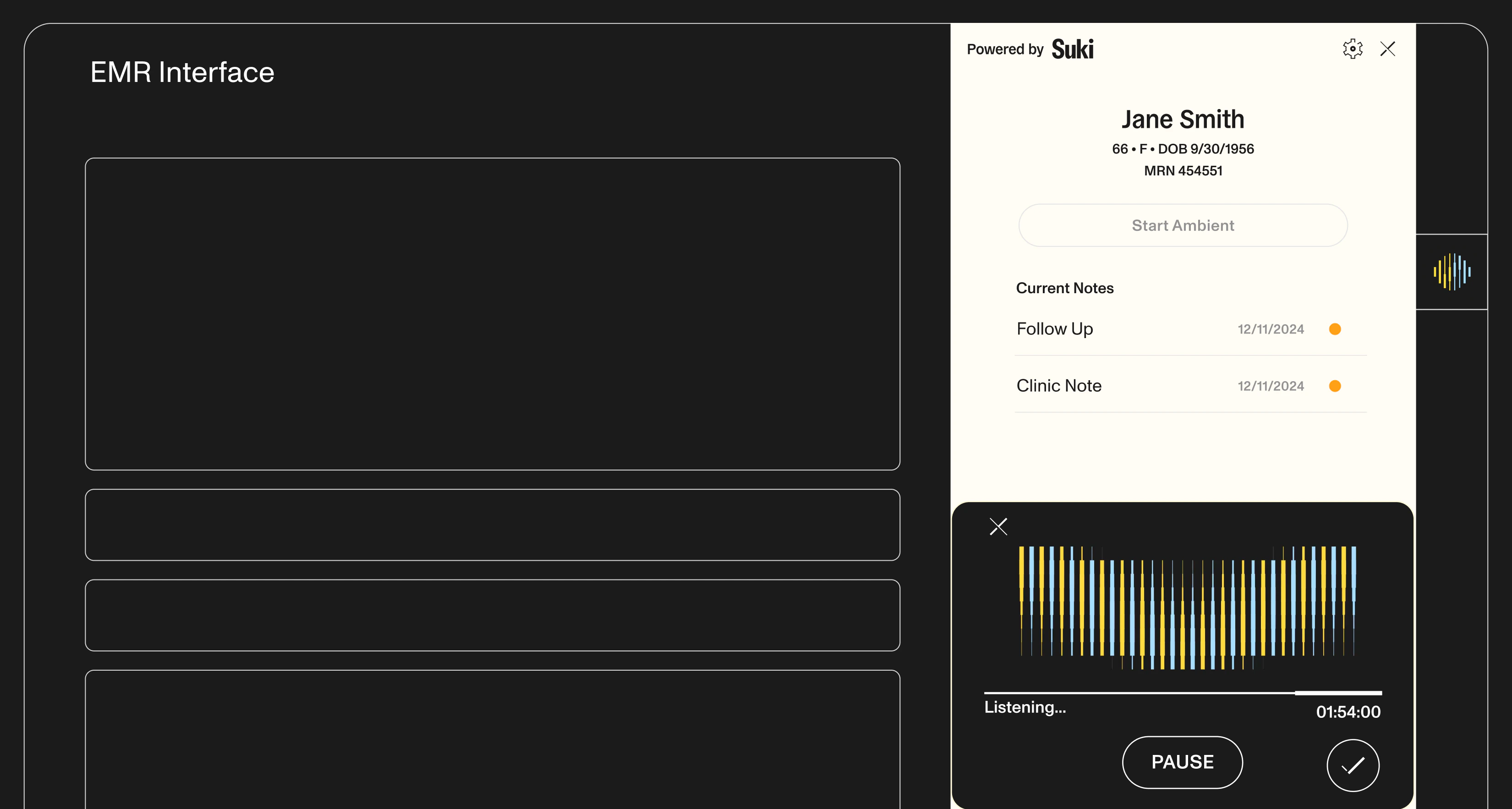
Theme colors
Pass an optionaltheme object when you call init. Theme colors default to Suki brand colors when omitted.
Supported ThemeOptions fields:
ThemeOptions Fields
ThemeOptions Fields
string
default:"rgb(28,28,28)"
The primary color of the theme in rgb.
string
default:"rgb(255, 255, 255)"
The primary background color of the theme in rgb.
string
default:"rgb(233, 233, 240)"
The secondary background color of the theme in rgb.
string
default:"rgb(0, 0, 0)"
The foreground and text color of the theme in rgb.
string
default:"rgb(255, 184, 0)"
The warning color used for alerts and notifications in rgb.
React
UI options
PassuiOptions to SukiAssistant to show or hide headed UI controls. Refer to UIOptions for the full property list.
React